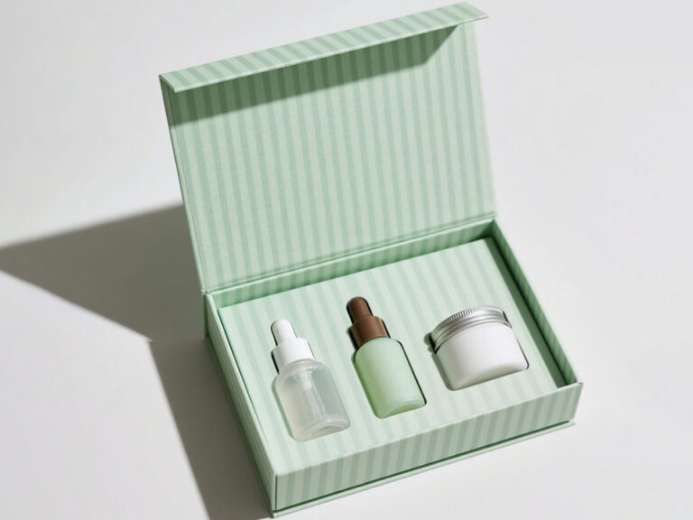
Let Our Packaging Experts Review Your Project
Share your packaging requirements before you leave. Our experts can review your dieline, artwork, materials, inserts, finishing, certifications, MOQ, quality checks, and delivery expectations.

Perfume packaging gets judged first.
Always.
We have watched it happen in stores, in sample rooms, in buying meetings, and on packing lines. Someone picks up the box. They feel the paper. They test the lid. They check the weight. Maybe they turn it once in the hand.
Then they decide.
Not after the first spray.
Before it.
That is the strange pressure of fragrance packaging. You sell something invisible, so the box has to make the scent feel real before the customer smells anything. Warm. Clean. Dark. Fresh. Powdery. Expensive. Playful. Serious. Whatever the juice promises, the package starts the conversation.
Statista’s 2026 fragrance outlook projects that the global fragrance market will generate more than $64 billion in revenue in 2026. See Statista’s 2026 Fragrances outlook.
Crowded market.
Crowded shelf.
Crowded feed.
So no, perfume packaging does not sit quietly in the background.
It works.
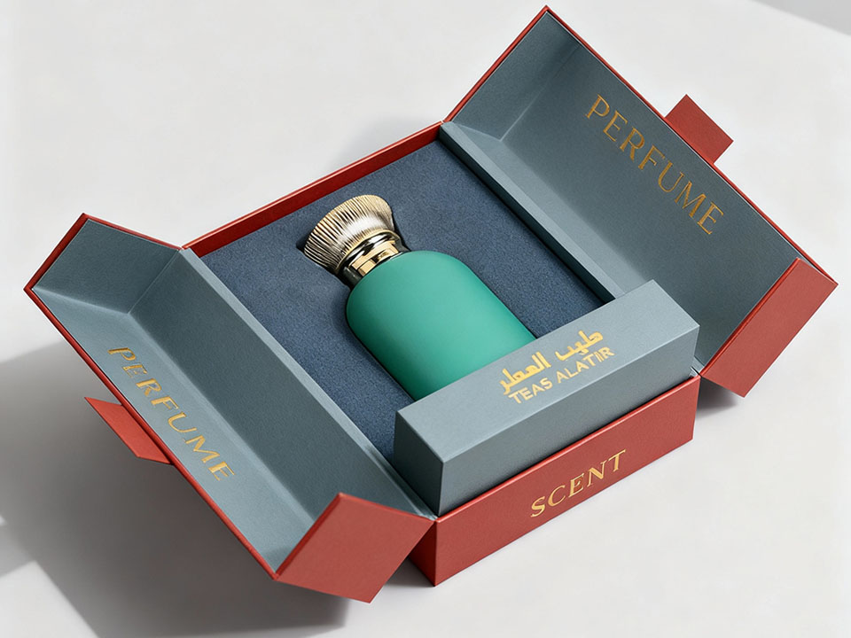
Look, perfume packaging is not just the pretty box.
That box matters. A lot. But it does not work alone.
In our experience, perfume packaging usually breaks into three layers.
| Packaging Layer | What It Does | Common Materials | Where Brands Get It Wrong |
|---|---|---|---|
| Primary packaging | Holds the fragrance liquid | Glass bottle, spray pump, cap, collar, label | Beautiful bottle, weak spray hardware, loose cap |
| Secondary packaging | Presents and protects the bottle | Folding carton, rigid box, drawer box, magnetic box, inserts | Box looks good but does not hold the bottle tight |
| Tertiary packaging | Protects during storage and shipping | Corrugated mailer, master carton, dividers, cushioning | Retail box is expected to survive courier abuse alone |
Most buyers notice the secondary packaging first.
Your operations team watches all three.
And both sides are right.
The outer perfume box has to look correct for the price point. The insert has to hold the bottle without friction, wobble, or awkward removal. The shipper has to survive the rough part nobody photographs.
We have noticed one mistake more than almost any other: brands obsess over the front panel and forget the bottle can move inside the box.
Bad move.
That little rattle becomes scuffing.
Scuffing becomes returns.
Returns become a margin problem.
A scent cannot stand on a shelf and explain itself.
The box does that job.
It turns “rose oud” into paper, foil, color, shadow, and weight. It turns “fresh linen” into space, typography, and restraint. It turns “smoked vanilla” into warmth, depth, and maybe a little metallic detail if the brand can pull it off.
Tiny choices carry meaning.
A matte ivory box tells one story.
A black rigid box with crisp foil tells another.
A kraft sleeve with blind debossing says something else entirely.
Customers do not analyze it like packaging engineers.
They just react.
Too shiny.
Too thin.
Too flat.
Too loud.
Or, better: this feels right.
That reaction sells.
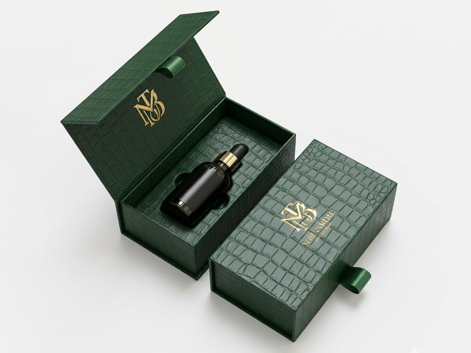
We see brands jump too fast.
“We want a drawer box.”
Maybe you do.
Maybe you do not.
A drawer box can look fantastic. So can a magnetic closure box. So can a simple two-piece rigid box. But structure should follow the fragrance, the channel, the buyer, and the price point.
Not a screenshot.
Ask better questions first:
That work comes first.
A light body mist and a $280 niche extrait should not wear the same box style. They may both smell great. They need different packaging logic.
Structure does the heavy lifting.
Box shape. Opening style. Wall thickness. Insert fit. Lid tension. Closure. Bottle support.
People sometimes treat these things like factory details.
They are not.
Perfume bottles often use glass. Many bottles carry thick bases, heavy caps, metal sprayers, collars, and more filled weight than the design team expects. The box needs to handle that weight without bowing, splitting, crushing, or letting the bottle knock around.
For entry-level retail, a folding carton may work well.
For premium and luxury fragrance, rigid paperboard usually feels better. It gives the box weight, clean edges, stronger presentation, and a slower opening moment.
That pause matters.
When the bottle, insert, print finish, and brand story all need to work together, custom perfume boxes usually make more sense than a stock structure.
Stock can work.
Custom works when details matter.
And in fragrance, details usually decide the sale.
Material choice changes almost everything.
Cost.
Feel.
Print quality.
Sustainability.
Shelf presence.
Shipping weight.
Durability.
No small thing.
| Material | Best For | Strengths | Watchouts |
|---|---|---|---|
| SBS paperboard | Folding cartons, clean cosmetics look | Smooth print surface, bright white base | Less premium than rigid board |
| Rigid greyboard | Luxury perfume boxes | Strong, weighty, premium hand-feel | Higher unit cost and freight weight |
| Kraft paperboard | Natural, eco-minded fragrance lines | Rustic look, recyclable appeal | Color printing appears muted |
| Corrugated board | DTC shipping and outer cartons | Better transit protection | Not always retail-polished |
| Molded pulp insert | Sustainable bottle holding | Plastic-free perception, shaped support | Tooling and fit must be accurate |
| Paperboard insert | Retail and gift sets | Print-friendly, cost-effective | Needs proper scoring and locking |
| EVA or foam insert | Heavy glass or luxury sets | Strong cushioning, neat presentation | Sustainability concerns unless specified |
Now sustainability.
We need to talk about it plainly.
McKinsey’s 2025 global packaging research found that paper and cardboard, along with glass, ranked within the top three perceived sustainable packaging types across every surveyed country. The same research found that recyclability ranked as the top sustainability trait across markets. See McKinsey’s 2025 global packaging survey.
Does paper solve every problem?
No.
It just gives customers a signal they understand quickly. That counts.
Typography can make a perfume box feel expensive in one glance.
It can also ruin the whole thing.
Fast.
We like expressive type. We really do. But perfume packaging has to work at real size, under real lighting, on a real shelf, in a real person’s hand.
So we keep a few rules close:
A thin serif can look elegant in a mockup and disappear on a 30 ml carton.
A bold sans serif can feel confident on a smoky amber fragrance and heavy-handed on a transparent floral.
Context decides.
Always.
Color talks fast.
Sometimes too fast.
Black can suggest luxury, mystery, leather, oud, tobacco, night, or formal gifting.
White can suggest softness, cleanliness, skin scents, florals, purity, or modern minimalism.
Green can point toward botanical, herbal, refillable, earthy, sustainable, or gender-neutral fragrance.
Gold and champagne tones can bring warmth, celebration, gifting, and premium cues.
But let’s be real.
Not every fragrance needs black and gold.
A bitter citrus scent might look brilliant in sharp orange. A powdery iris extrait may not. A marine fragrance may need pale blue, or it may need no blue at all if the brand wants to avoid the obvious route.
Color should serve the scent.
Not the trend board.
Finishes add touch.
They also tempt brands into bad decisions.
We have all seen the sample box that tries to do everything at once: foil, embossing, debossing, spot UV, metallic ink, soft touch, glitter, texture, and a ribbon.
Too much.
The best options include:
One finish executed cleanly can carry the whole box.
Five finishes can make the box look nervous.
Harsh?
Maybe.
Still true.
The insert handles the unglamorous work.
It holds the bottle. It protects the sprayer. It supports the base. It frames the reveal. It keeps glass from moving when the package gets handled, packed, shipped, dropped, stacked, and opened.
Basically, the insert saves everyone later.
| Insert Type | Best Use | Why It Works |
|---|---|---|
| Folded paperboard insert | Standard perfume boxes | Good cost-to-protection balance |
| Molded pulp tray | Sustainable fragrance lines | Plastic-free look and shaped support |
| EVA/foam insert | Luxury or heavy glass bottles | Cushions well and presents cleanly |
| Cardboard dividers | Gift sets or discovery kits | Keeps bottles from touching |
| Neck-lock insert | Tall or narrow bottles | Stops bottle wobble near the sprayer |
Please test the insert.
Not with an empty bottle only.
Use a filled bottle. Use the real cap. Use the real sprayer. Shake the full pack-out. Drop-test it. Let the packing team handle it.
A bottle that shifts a little in the sample room can shift a lot in transit.
Tiny gap.
Big problem.
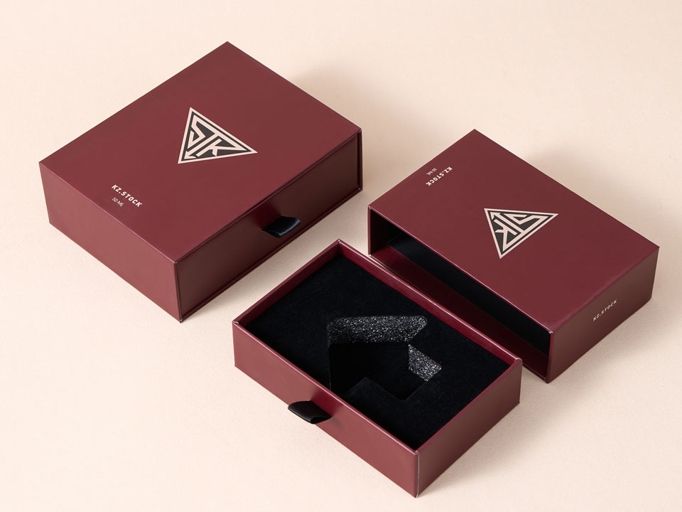
The folding carton is the workhorse.
Light. Printable. Cost-efficient. Scalable.
It works well for:
A folding carton does not automatically look cheap.
Bad folding cartons look cheap.
Good ones look sharp, clean, and commercial. The difference usually comes down to paper grade, print control, dieline strength, and finishing discipline.
For luxury fragrance, though, a standard folding carton may feel too light unless every detail carries real quality.
Rigid boxes often carry premium and luxury fragrance better.
They feel solid. They hold shape. They photograph well. They slow the opening down in a good way.
That matters.
Rigid boxes work especially well for:
They cost more.
Of course.
But they can make a fragrance feel more believable at a higher price point. If the bottle, scent, and retail strategy support the spend, rigid packaging can pay back through perceived value.
We have seen that happen plenty of times.
A good magnetic closure gives a satisfying snap.
Not loud.
Just enough.
For fragrance brands that want a polished open-and-close moment, magnetic closure boxes can work beautifully.
They feel gift-ready. They also encourage customers to keep the box, especially for sets, minis, or premium discovery kits.
Use them for:
One warning.
Magnets add cost, and they can affect recyclability depending on local sorting systems. If sustainability sits near the center of the brand, ask the supplier how the magnetic components fit into the overall material story.
Ask early.
Not after artwork approval.
Some fragrances need a reveal.
Not shouting.
A reveal.
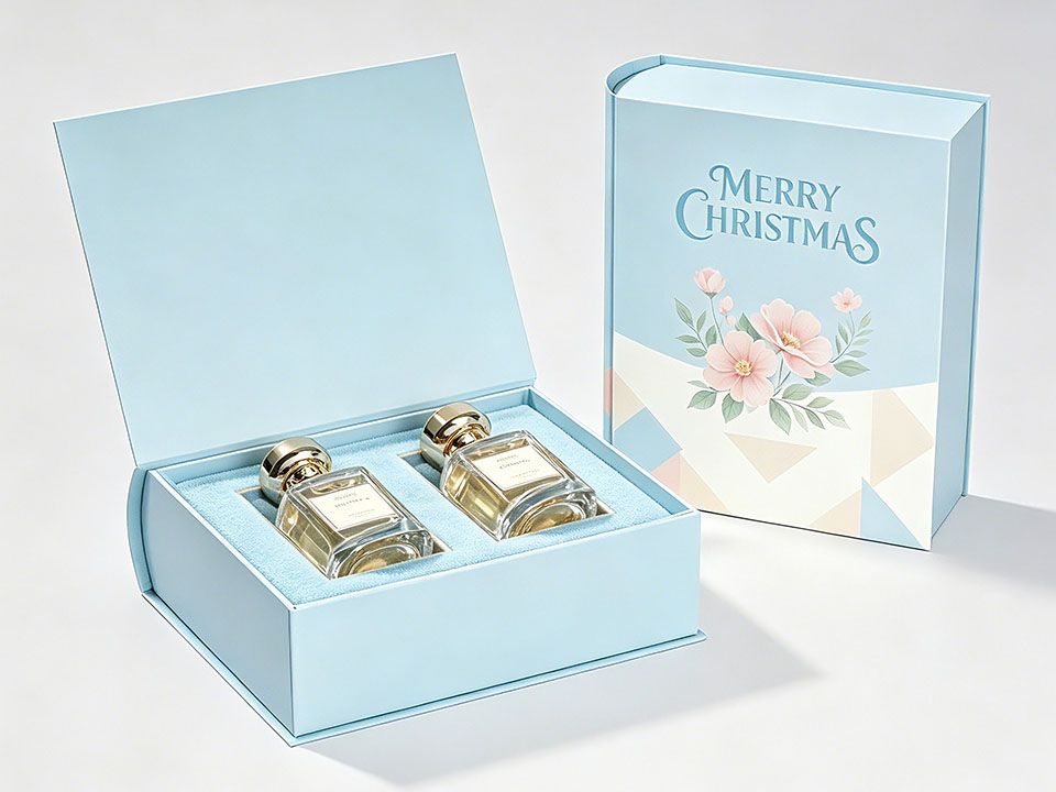
That is where double door rigid boxes make sense. They open like a small cabinet or presentation case, so the product gets a little ceremony.
This structure works beautifully for:
We would not put every perfume in a double door rigid box.
Too much cost. Too much material. Too much structure for a simple SKU.
But for the right launch, it lands.
Drawer boxes feel neat.
Controlled.
Almost ritualistic.
The sleeve and sliding tray create a slower opening. That makes paper drawer boxes a strong fit for discovery sets, travel sizes, and small fragrance collections.
They also help when the insert needs to hold several small bottles in a clean row.
Pull.
Pause.
Reveal.
That rhythm suits perfume.
A two-piece box still works because people understand it instantly.
No instructions needed.
lid lift-off boxes give perfume brands a sturdy, familiar structure that can look classic, modern, minimal, or ornate depending on paper, color, foil, and insert design.
Use them for:
The trick sits in the lid fit.
Too loose feels cheap.
Too tight annoys people.
The right fit gives a controlled slide and a clean reveal. Small thing. Big difference.
Keep it clear.
Not boring.
Clear.
Mass-market fragrance packaging has to work quickly. Shoppers need to understand the scent family, brand, size, and basic mood without studying the box like a museum label.
Use folding cartons, strong shelf color, readable naming, and simple finish choices that protect margin.
Customers should know quickly whether the fragrance feels fresh, floral, woody, sweet, spicy, sporty, or clean.
Speed matters here.
Premium packaging needs more control.
Better paper. Better edges. Better finish registration. Better insert fit. Better copy hierarchy.
You can use:
Premium perfume packaging should feel expensive without feeling wasteful.
That balance matters more now.
People still love a beautiful box. They also notice excess. We have noticed buyers ask smarter questions about materials, refill options, and unnecessary plastic. Brands should prepare for that.
Luxury packaging usually does less.
But it does less better.
Fewer colors. Better paper. Cleaner edges. Sharper typography. More precise foil. Better lid tension. Stronger insert design.
Luxury buyers notice quiet mistakes.
Glue marks.
Fuzzy foil.
Weak corners.
Loose inserts.
Scuffed paper.
A lid that drops too fast.
A bottle that rattles.
Those details either support the price or expose it.
No middle ground.
Niche fragrance brands can take risks.
Good.
Use strange textures. Literary copy. Monochrome labels. Experimental type. Hand-drawn marks. Refill-first systems. Small-batch numbering.
Go there.
But weird alone does not sell.
We have seen eccentric packaging that felt brilliant, and we have seen eccentric packaging that felt unfinished. The difference comes down to intention. The bottle still needs protection. The buyer still needs orientation. The story still needs clarity.
The best indie packaging feels personal, not sloppy.
A leaf icon does not make packaging sustainable.
Let’s be real.
Customers have seen too many vague green claims. They want clearer signals, and many of them now act on those preferences.
Shorr’s 2025 Sustainable Packaging Consumer Report found that 54% of surveyed U.S. consumers had deliberately chosen products with sustainable packaging in the previous six months. The same report found that 90% said they were more likely to buy from a brand or retailer using eco-friendly packaging. See Shorr’s 2025 Sustainable Packaging Consumer Report.
For perfume packaging, sustainable choices can include:
But claims need proof.
Better claims:
Weak claims:
Those lines may sound fine in a meeting.
They sound weaker when a buyer asks, “Can you prove that?”
Use specifics.
Specifics build trust.
Start with the product.
Then the channel.
Then the price.
Then the margin.
Then the unboxing moment.
In that order.
| Brand Need | Best Box Style | Why |
|---|---|---|
| Low-cost retail launch | Folding carton | Affordable, printable, scalable |
| Premium single bottle | Rigid box or lid lift-off box | Better weight and presentation |
| Luxury gift set | Magnetic closure box | Strong opening experience |
| Two-bottle set | Double door rigid box | Balanced reveal and premium feel |
| Discovery kit | Paper drawer box | Easy tray layout for multiple vials |
| DTC shipping | Retail box plus corrugated shipper | Better transit protection |
| Sustainable niche launch | Kraft rigid box or paperboard carton | Natural look and clearer disposal story |
| Influencer PR kit | Magnetic or double door rigid box | More visual impact on camera |
The weak approach sounds like this: “We saw a box online and want that.”
The better approach sounds like this: “Here is the bottle weight, channel, price point, buyer, insert need, sustainability goal, and launch quantity.”
That second version leads to better packaging.
Every time.
E-commerce can be brutal.
A retail shelf behaves politely.
A delivery network does not.
Your package may get tossed, stacked, squeezed, scanned, dropped, rerouted, and jammed next to a box of shoes. The pretty retail box cannot carry that burden alone.
So we think in layers:
And yes, fragrance shipping can involve rules depending on alcohol content, carrier, country, and transport method.
Do not guess.
Check current carrier rules before shipping at scale, especially for alcohol-based perfumes.
A beautiful box that arrives damaged still fails.
Simple as that.
The front panel sells.
The side and back panels explain.
That split keeps the box clean and useful.
Common perfume box content includes:
Do not cram everything onto the front.
Give the customer the emotional cue first. Then give the practical details where they belong.
A perfume box should feel calm, not crowded.
Less noise.
Better materials.
We keep seeing matte paper, blind debossing, soft neutrals, warm whites, deep browns, charcoal, and restrained foil. Not flashy. Not dull either.
Just controlled.
The box whispers because the brand can afford not to shout.
Refillable fragrance no longer feels like a side project.
More brands now treat refills as part of the main product experience. Packaging has to explain the refill process clearly without making the customer work too hard.
Use inserts, QR codes, icons, and side-panel copy to make refilling feel obvious.
If people feel confused, they will not refill.
They will just buy something else.
Many fragrance brands now avoid rigid “for him” and “for her” packaging.
We see more:
This does not mean bland.
It means the scent leads.
And honestly, that feels overdue.
Texture sells quietly.
Linen paper. Uncoated stock. Embossed grain. Molded pulp. Raw paper edges.
These details can make a box feel crafted without adding loud graphics. For fragrance, touch carries real weight because the product already lives in the senses.
Smell comes later.
Touch comes first.
Customers want to try before they commit.
Fair.
That creates demand for packaging that can hold 2 ml, 5 ml, 10 ml, and travel-size formats neatly. Drawer boxes, sleeve trays, and rigid sampler kits fit that behavior well.
The challenge?
Small must not feel cheap.
A discovery set should feel like an invitation, not a leftover sample pack.
Social media still matters.
But loud, shiny, overdone packaging feels tired.
Good fragrance packaging now needs to look clean under natural light, sit well in hand, and create a simple opening moment people can record without staging a full production.
A good box does not beg for attention.
It gives people something worth noticing.
Artwork is not packaging.
The dieline, insert, bottle fit, paper grain, coating, fold lines, and closure all matter.
A beautiful print file can still turn into a weak box.
We have seen it.
Everyone has seen it.
Foil, emboss, deboss, spot UV, glitter, metallic ink, and soft touch on one box?
Please do not.
Pick the finish that supports the brand mood. Execute it cleanly. Stop there.
Confidence usually looks simpler than insecurity.
Perfume bottles can feel surprisingly heavy.
Especially with thick glass and a decorative cap.
If the board is too thin or the insert is weak, the box starts to bow, split, or feel unstable. The buyer may not know the technical reason.
They will still feel the problem.
A green icon does not do the work.
Material selection does.
Recyclability does.
Recycled content does.
Refill systems do.
Reduced waste does.
Clear claims do.
If sustainability matters to the brand, build it into the structure. Do not paste it onto the artwork at the end.
Opening order matters.
What does the customer see first?
The logo?
The bottle cap?
A message?
A tray?
A sample?
A refill card?
Design that sequence.
Do not leave it to chance. Fragrance should feel considered from the first touch to the first spray.
Start with a real brief.
Not a vague mood board.
Not ten screenshots from luxury brands with completely different price points.
A real brief.
Include:
This keeps the project from turning into a taste argument.
And packaging projects can become taste arguments very quickly.
Measure everything.
Then allow room for insert grip, board thickness, and production variance.
Tight feels good.
Too tight creates problems.
A rendering may look perfect. A real filled bottle may tell a different story.
Listen to the bottle.
Now choose the structure.
A discovery set may need a drawer.
A luxury gift set may need a magnetic closure.
A minimalist niche fragrance may need a lid lift-off rigid box.
A mainstream retail launch may need a folding carton.
There is no universal best perfume box.
Only the right box for this bottle, this buyer, this channel, and this margin.
The insert should hold the bottle firmly without making removal annoying.
Test it with:
That last one matters more than brands expect.
If the packing team struggles with the insert, production slows down. If removal feels awkward, the customer notices. If the bottle shifts, transit damage shows up later.
The insert has to satisfy everyone.
Hard job.
Important job.
Now bring in typography, color, pattern, icons, barcode placement, fragrance copy, and required information.
Build a clear hierarchy:
Do not make customers hunt for the basics.
They will not admire the mystery.
They will move on.
Choose finishes based on mood and budget.
A few pairings we like:
Review finish samples in real light.
Office lights lie.
Mockups lie harder.
A finish that looks perfect on screen may feel flat, sticky, too shiny, or too fragile in hand.
Get a physical sample.
No shortcut.
Check:
A prototype catches problems while they still cost less to fix.
That is the point.
Skipping it rarely saves money.
It just moves the cost later.
Do not assume the retail box can survive courier shipping alone.
Run basic drop, shake, compression, and pack-out checks. For regulated shipments, confirm current rules with your carrier and compliance partner.
Perfume packaging has to look beautiful after the ugly part of logistics.
That is the real test.
Before production, lock every detail.
Small changes at this stage can create big differences.
Sometimes expensive ones.
So slow down here.
Inspect the first batch before scaling.
Not one perfect sample.
Multiple cartons.
Look for color shifts, crushed corners, insert variance, foil breaks, lid-fit issues, scuffs, and glue marks.
Then refine.
Packaging improves when brands treat it like a product system, not a one-time purchase order.
For mass-market perfume, folding cartons often work well. For premium or luxury perfume, rigid boxes with custom inserts usually offer stronger presentation and protection. The best choice depends on bottle weight, price point, channel, and brand positioning.
The bottle, sprayer, cap, collar, and any label directly attached to the bottle make up primary packaging. The box around the bottle serves as secondary packaging.
Common materials include SBS paperboard, rigid greyboard, kraft paperboard, corrugated board, textured paper, molded pulp inserts, paperboard inserts, and specialty coatings or foils.
Use stronger structure, better paper, restrained typography, precise foil or embossing, clean inserts, and tight production tolerances. Expensive-looking packaging usually comes from control, not clutter.
Yes. Use recyclable paperboard, recycled content, plastic-free inserts, FSC-certified materials, refill-friendly formats, and clear disposal instructions. Avoid broad claims unless you can prove them.
Use a secure bottle closure, an insert that stops movement, a strong retail box, cushioning, and a suitable outer shipper. Check carrier rules before shipping alcohol-based fragrance, especially across borders.
The best perfume packaging does not shout.
It reassures.
It tells the buyer, “You chose well.”
That is the job.
Protect the bottle. Support the price. Match the scent. Photograph cleanly. Ship safely. Give the customer a small moment they remember.
Start with the fragrance story.
Engineer around the bottle.
Then make every material, finish, insert, and opening motion earn its place.
That is how perfume packaging becomes more than a box.
Comments