Industry News
Minimalist Vs. Bold Illustration Styles In Food Packaging
Minimalist Vs. Bold Illustration Styles In Food Packaging
Summary
Minimalist and bold illustration styles in food packaging represent two distinct approaches that significantly influence consumer perceptions and brand identity. Minimalist designs prioritize simplicity, clarity, and functionality, utilizing clean lines, restrained color palettes, and ample whitespace to create an unobtrusive aesthetic that fosters a sense of sophistication and modernity. This style appeals particularly to consumers seeking authenticity and sustainability, as it often requires fewer materials and resonates with the growing trend of eco-consciousness. In contrast, bold illustration styles embrace vibrant colors, dynamic patterns, and playful typography, effectively capturing attention and conveying excitement, especially among younger audiences. These striking designs can enhance visibility and brand recognition on crowded shelves, while also fostering emotional connections with consumers.
The choice between minimalist and bold styles can significantly impact consumer decision-making. Research indicates that minimalist illustrations can reduce cognitive load, allowing for quicker and more confident purchasing decisions, while bold designs can evoke feelings of urgency and excitement that may trigger impulsive buying behaviors. Both styles have unique psychological effects, with minimalism promoting calm and clarity, and boldness encouraging engagement and memorability. The ongoing dialogue between these styles highlights the necessity for brands to carefully consider their target audiences and the specific messages they wish to convey, ultimately aiming to strike a balance that enhances consumer loyalty and brand perception.
As of 2024, market trends reveal a nuanced understanding of these design styles, with a notable shift towards minimalist packaging driven by sustainability concerns, alongside a sustained demand for bold designs, particularly in luxury and special edition products. The evolution of consumer preferences necessitates that brands conduct thorough market research to identify which style aligns best with their branding strategies while addressing cost efficiency and consumer values. Additionally, cultural influences, demographic factors, and the historical context of packaging design further complicate the decision-making process, underscoring the importance of adaptability in a rapidly changing market landscape.
Ultimately, the effectiveness of minimalist versus bold illustration styles in food packaging hinges on their ability to resonate emotionally with consumers, convey brand messaging effectively, and meet the evolving expectations of diverse market segments. As brands navigate this complex landscape, the successful integration of these design principles can enhance visibility, foster loyalty, and ultimately drive sales.
Minimalist Illustration Style
Minimalist illustration styles in food packaging focus on simplicity and clarity, utilizing fewer elements to create a clean and unobtrusive design. This approach aims to enhance the consumer's ability to process information rapidly, thereby leveraging perceptual fluency, which refers to the ease with which individuals recognize and understand visual stimuli. The use of minimalist designs can foster a sense of sophistication and modernity, appealing to consumers who appreciate understated elegance.
Impact on Consumer Perception
Research indicates that minimalist illustrations can significantly influence consumer behavior by promoting positive emotions and associations with the product. A study highlighted the importance of color in packaging, noting that minimalist designs often utilize strategic color choices that align with consumer expectations of freshness and health. For instance, brands may choose softer hues or muted tones to evoke feelings of calmness and trust, which can enhance purchase intentions.
Emotional Connection and Brand Identity
The minimalist style not only simplifies the visual experience but also strengthens brand identity. By using a consistent color palette and design elements, brands can create a recognizable aesthetic that resonates with their target audience. For example, Tiffany & Co.'s iconic blue packaging exemplifies how a simple yet distinctive color choice can evoke excitement and recognition without additional branding elements. This emotional connection reinforces consumer loyalty and encourages repeat purchases.
Consumer Decision Making
Minimalist illustration styles also play a crucial role in decision-making processes. The simplicity of these designs allows consumers to focus on essential information, reducing cognitive load and facilitating quicker purchasing decisions. Effective use of whitespace and clear typography ensures that product details are easily accessible, further enhancing the likelihood of purchase. As consumers are constantly bombarded with visual stimuli, a minimalist approach can stand out by providing clarity in a crowded marketplace, making the product more appealing.
Bold Illustration Style
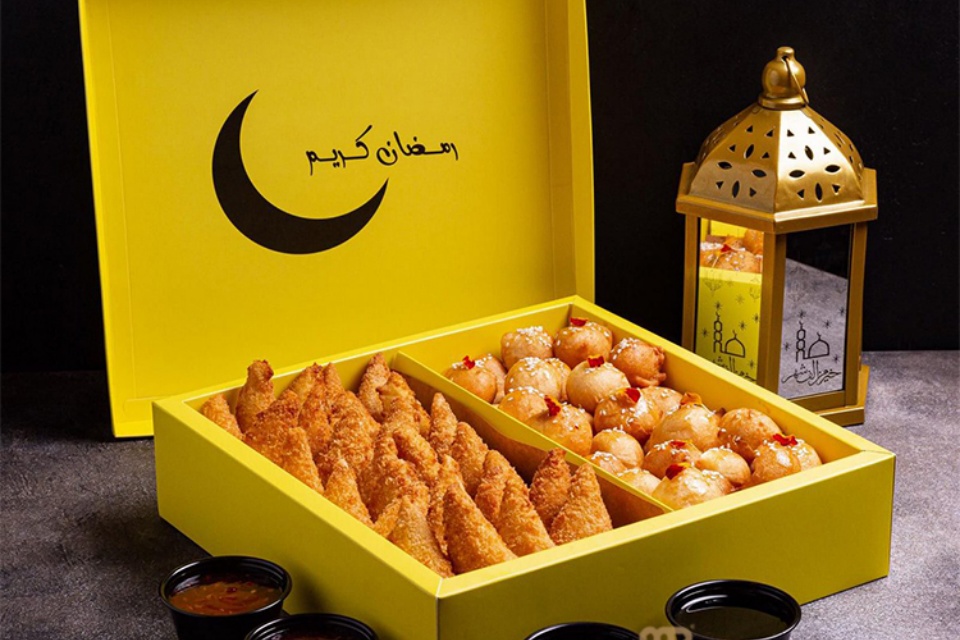
Bold illustration styles in food packaging are characterized by vibrant colors, dynamic patterns, and playful typography. This approach is particularly effective for brands targeting younger audiences or those seeking to convey a sense of excitement and innovation. The use of bright colors and quirky fonts can significantly enhance a product's visibility on the shelf, capturing consumers' attention and fostering an energetic brand image.
Impact on Consumer Perception
Bold packaging designs have been shown to influence consumer perceptions positively. Research indicates that products presented with vivid colors are often perceived as more effective or potent compared to those utilizing muted tones. This heightened perception is critical as it can lead to increased consumer interest and a stronger likelihood of purchase. The psychological effects of color also play a vital role; for example, red is often associated with excitement and urgency, which can trigger impulsive buying behavior.
Brand Recognition and Loyalty
Familiarity with bold design elements can foster brand loyalty over time. Consumers tend to gravitate toward designs they recognize, which may include specific color palettes, logo placements, and packaging shapes. This repetitive exposure to bold illustrations can solidify a brand's identity in the consumer's mind, contributing to long-term loyalty. Furthermore, the consistency in bold packaging design can reassure consumers about the quality and reliability of the products they choose.
Application of Bold Design
In practice, the application of bold illustration styles in food packaging involves strategically utilizing bright colors, whimsical graphics, and attention-grabbing fonts. This style can be particularly beneficial for products that aim to communicate fun and creativity, such as snacks, beverages, or products aimed at children. Marketers often leverage these design principles to create an emotional connection with consumers, reinforcing brand values and enhancing overall appeal.
By effectively balancing bold visual elements with the product's messaging, brands can create compelling packaging that not only stands out on the shelf but also resonates with their target audience.
Comparison of Minimalist and Bold Styles
Overview of Design Styles
In the realm of food packaging, two prominent design styles emerge: minimalist and bold. Each style offers distinct advantages that cater to different consumer preferences and branding strategies. While minimalist designs emphasize clarity, elegance, and timelessness, bold designs provide a dramatic, captivating, and memorable approach. The choice between these styles often hinges on the target audience, brand identity, and the specific message the brand aims to convey.
Characteristics of Minimalist Designs
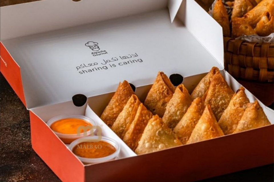
Minimalist packaging focuses on simplicity and functionality. This approach utilizes clean lines, negative space, and restrained color palettes to highlight the product's essence without overwhelming the consumer. The appeal of minimalist designs lies in their ability to evoke authenticity and transparency, resonating particularly well with younger consumers who are influenced by digital media. Furthermore, this style aligns with growing sustainability trends, as minimalist packaging often requires fewer materials and promotes eco-friendly practices.
Characteristics of Bold Designs
In contrast, bold designs are characterized by high-contrast colors, industrial fonts, and an emphasis on visual impact. This style leverages striking imagery and elaborate graphics to capture attention in a crowded market, making it ideal for products that aim to create a memorable impression. Bold designs are particularly effective in conveying strong brand messages and engaging consumers emotionally, which can significantly influence purchasing decisions.
Psychological Impact on Consumers
Both minimalist and bold styles have unique psychological effects on consumers. Minimalist designs tend to promote feelings of calm and clarity, often enhancing perceived fluency during the purchasing process. Research suggests that clean designs can lead to higher purchase intentions, particularly when presented with cold colors that suggest virtue and quality. Conversely, bold designs can create a sense of excitement and urgency, drawing consumers in with their vibrant visuals and dynamic presentations.
Market Trends and Consumer Preferences
As of 2024, consumer preferences reflect a nuanced understanding of these design styles. While there is a notable shift toward minimalist packaging, driven by sustainability concerns and the desire for authenticity, there remains a substantial market for bold designs, especially within luxury goods and special editions. Brands must consider these evolving trends and conduct market research to determine which style aligns best with their target audience while balancing cost efficiency and brand identity.
Cultural Influences
Cultural factors significantly shape packaging design, influencing consumer perceptions, brand interactions, and purchasing decisions. These influences extend beyond mere aesthetics, affecting how products are marketed and received in different regions of the world. With the rise of e-commerce, understanding cultural nuances has become increasingly crucial, as consumers now have access to a vast array of products from diverse markets. Brands that successfully navigate these cultural differences are better equipped to foster trust and loyalty among consumers.
The Role of Colors in Cultural Perception
Colors are powerful symbols that evoke specific emotions and associations; however, their meanings can differ widely across cultures. For instance, while white often symbolizes purity in Western cultures, it is associated with mourning in many Eastern cultures. This divergence necessitates a careful selection of colors in packaging design to align with cultural expectations. Green is frequently linked to eco-friendliness, while gold or silver denotes luxury, highlighting how color associations are rooted in cultural perceptions. Research shows that color can influence consumer emotions and taste perceptions, with warm colors like red stimulating appetite and conveying a sense of deliciousness, whereas cool colors suggest freshness and health.
Typography and Language Preferences
Cultural influences are also evident in typography and language choices within packaging design. Different cultures exhibit distinct preferences for typefaces and text layouts. For example, in cultures where reading occurs from right to left, such as Arabic-speaking countries, packaging must be adapted to ensure readability. Additionally, language plays a critical role in shaping product perceptions, as words can carry varied meanings across different languages. Misleading translations may create confusion, necessitating a thoughtful approach to language use in packaging.
Sustainability and Cultural Sensitivity
In recent years, cultural shifts towards environmental consciousness have prompted changes in packaging design, emphasizing sustainability and ethical production. This trend influences consumer expectations and industry standards globally. Brands must demonstrate cultural sensitivity by acknowledging the values, beliefs, and traditions of diverse consumer groups to establish trust and loyalty. Minimalist designs may resonate with certain cultures that value simplicity and sustainability, while bold illustrations may appeal to those who prefer vibrant and expressive packaging styles.
Demographic Factors
Demographic factors significantly influence consumer perceptions of food packaging, particularly in the context of minimalist versus bold illustration styles. Variables such as age, gender, education, and occupation can shape individual preferences and reactions to different packaging designs. For instance, younger consumers, including Millennials and Gen Z, often gravitate toward minimalist designs that reflect their values of sustainability and simplicity. These demographic groups tend to favor eco-friendly packaging options, emphasizing their environmental concerns and lifestyle preferences.
In contrast, older demographics may respond more positively to elaborate and decorative packaging that conveys a sense of luxury and exclusivity. This generational divide highlights the importance of tailoring packaging strategies to align with the values and expectations of distinct target audiences. Additionally, gender differences may also play a role in packaging appeal, as research suggests that male and female consumers might prioritize different elements in design, such as color and imagery, when making purchasing decisions.
Understanding these demographic factors is crucial for brands aiming to optimize their packaging strategies. By integrating insights about consumer preferences across different demographic segments, brands can enhance trust and loyalty among their target audiences, ultimately improving market performance. As the market continues to evolve, the ability to adapt packaging designs to meet the needs of diverse consumer groups will become increasingly important.
Evolution of Illustration Styles
Historical Context
The evolution of illustration styles in food packaging has deep historical roots, significantly shaping consumer perception and marketing strategies. Initially, illustrations served practical purposes, primarily for identifying and branding products. In ancient times, as seen in the early practices of the Egyptians and Chinese, various materials were utilized for packaging, and simple decorative elements began to appear as a form of branding. This early usage of illustrations was crucial as it laid the foundation for more sophisticated designs in the following centuries.
The Golden Age of Illustration
The mid-20th century marked the Golden Age of Illustration, particularly in the United States. During the 1950s and 1960s, illustrators began to experiment with more creative and artistic approaches to food packaging. This era saw a surge in talent and a shift towards painting and detailed artwork, which captivated consumers and enhanced the allure of products. Illustrators like Norman Rockwell became iconic figures, demonstrating the potential of illustrations to convey emotions and narratives that resonate with consumers.
The Rise of Minimalism
In recent years, minimalist illustration styles have emerged as a prominent trend in food packaging design. This movement advocates for a simpler, uncluttered aesthetic, focusing on essential elements to communicate brand identity effectively. Minimalist designs often evoke feelings of sophistication and modernity, aligning with consumer values of sustainability and conscious consumerism. As this trend gained traction, many brands adopted minimalist illustrations to create a visual break from overstimulating environments, appealing to consumers seeking a mental escape.
Abstract and Hand-Drawn Styles
Parallel to the minimalist movement, abstract illustrations have found their niche within the food packaging industry. These designs often employ non-representational imagery, geometric patterns, and color gradients, conveying a sense of innovation and exclusivity. Abstract illustrations are particularly prevalent in luxury and artisan food products, aiming to attract a specific audience with a bold and distinct visual language. Conversely, hand-drawn and sketched illustrations continue to resonate with consumers, offering a personal touch that evokes nostalgia and authenticity.
Balancing Boldness and Minimalism
Today, there is an ongoing dialogue between bold and minimalist illustration styles. Brands must navigate the dichotomy between standing out on crowded shelves and adhering to minimalist design principles. Successful packaging often incorporates elements of both styles, ensuring that products are visually appealing while effectively conveying brand messaging. As consumer preferences evolve, the challenge for designers lies in creating packaging that is not only functional but also resonates emotionally with their target audience, ultimately enhancing brand loyalty and recognition.
Categories
Latest News
Contact Us
Contact: Aaron Lee
Phone: +8613570866244
Tel: +8675529490260
Add: Li Songlang 2nd Industrial Zone,No.18,FengTang Rd,Guangming New District


